Designing Doodleblue's own typeface — building a typographic voice from scratch
A custom typeface that became a differentiator for the brand, contributing to a 20% bump in sales conversions
Role
Duration
Tools
Team

Overview
The Signature Typeface shows the same instinct at its most self-directed: nobody asked for a custom typeface, I saw the brand deserved one, and built it myself over three months and it is useful for improving Brand identity, and later positioned as a service offering to clients.
Statement
Doodleblue positioned itself as a distinct, self-owned brand — its logo and website had their own visual identity — but the typography was still running on generic Google Fonts. That mismatch meant the brand's typographic voice didn't match the uniqueness it claimed everywhere else. I saw this gap and initiated the idea myself: build Doodleblue its own typeface, so the brand had a voice as distinct as its logo
What I Led
Personally initiated the project — no one asked for it, I identified the gap and made the case that it would bring real value to the organization
Set the research direction: studying the existing logo construction to understand what typeface qualities it implied
Directed the full build process from research through to final delivery across 3+ months

What I Designed
Analyzed the Doodleblue logo's letterforms and determined it was a serif/sans-serif hybrid, leaning toward sans-serif — and used that as the foundation for the new typeface's direction
Designed the complete character set by hand: A-Z, 0-9, and special characters
Built and refined the typeface in Glyphs and FontForge, including:
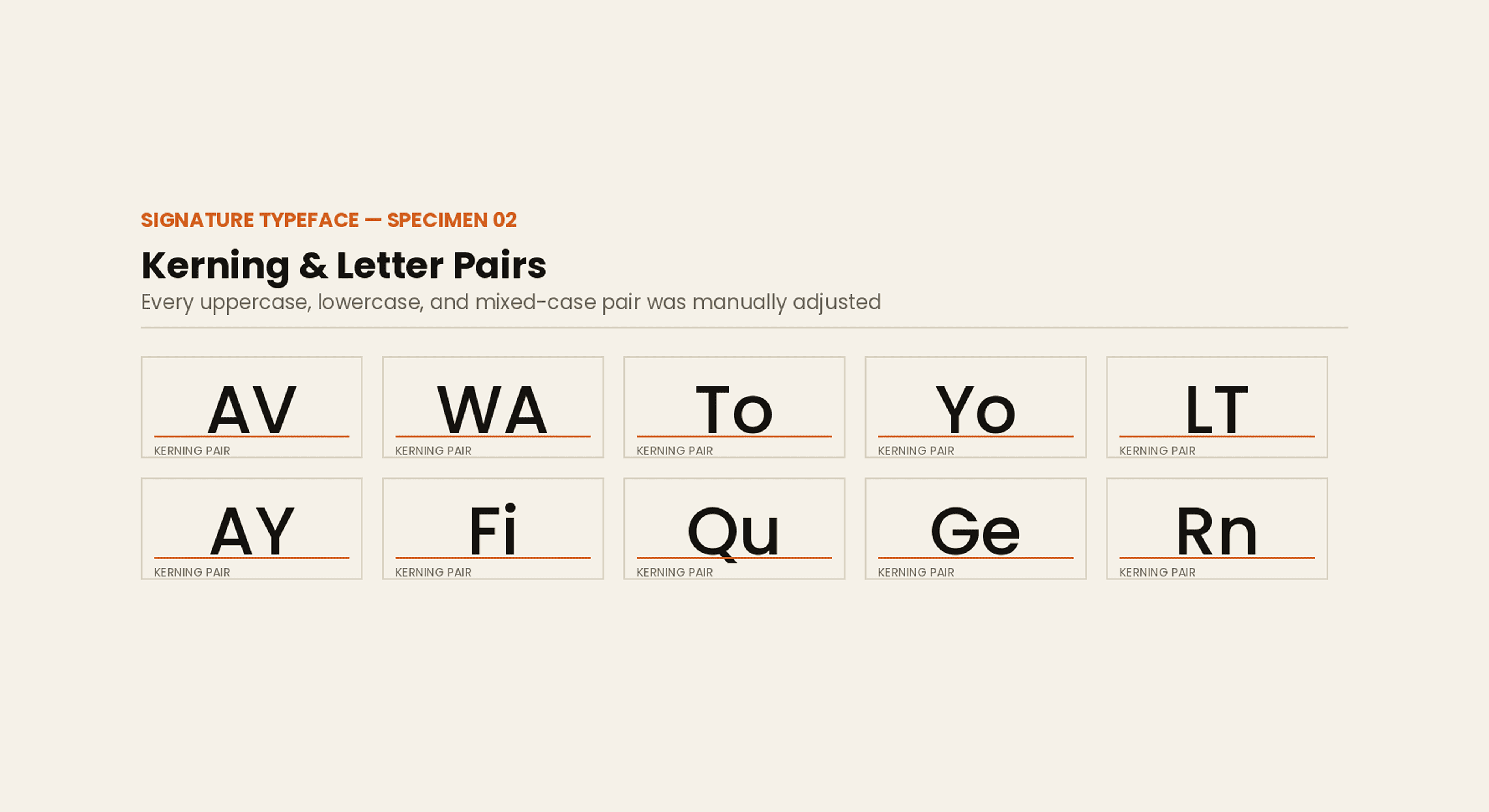
Kerning across every letter combination (uppercase-uppercase, uppercase-lowercase, lowercase-lowercase)
Precise height and sizing adjustments for complex letterforms (Y, G, Q, and similar shapes needed careful individual attention)
The overall bounding-box height, so the typeface behaved correctly within standard type-setting views
Key Decisions & Trade-offs
Sans-serif direction over a literal serif/sans hybrid: the logo itself mixed serif and sans qualities, but I chose to lean the typeface toward sans-serif for better legibility and versatility across brand and digital use, rather than mirroring the logo exactly.
Investing 3+ months in a non-product deliverable: took on a long, detail-heavy build (kerning, bounding box, per-letter adjustments) with no immediate product ROI, betting on brand differentiation and future business value instead.
Building from scratch in specialist tools (Glyphs + FontForge) rather than customizing an existing font, which took longer but gave full control over the brand's exact typographic voice.
Final Design



Impact
Became Doodleblue's signature typeface, replacing generic Google Fonts across the brand
Created a new business angle: it demonstrated to clients that Doodleblue could design a custom typeface as part of its branding services, alongside its existing brand design offering
Contributed to a 20% increase in sales conversions, as prospective clients noticed the typeface and it drew more attention to the organization's capability
A rare craft signal most design leaders can't point to — proof of typographic skill and initiative beyond standard product design scope
Leadership Moment
Nobody assigned this project. I personally identified that the typography didn't match the brand's stated uniqueness, made the case that building a custom typeface would bring real value to the organization, and initiated it myself over a 3+ month build and turning a self-directed craft project into a business differentiator that ended up influencing actual sales conversions.

